Wednesday, 31 March 2010

GRAD FILM

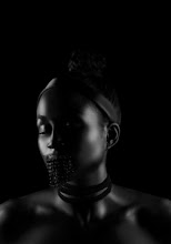
The graduate film was shot today for our degree show . The theme was club kids, here's some shots of my model..


Monday, 22 March 2010

RIVER OF RAINBOW


Today I shot my Morris Louis inspired look. My model was laid on the floor whilst I first painted on each colour then dripped the paint from the top to create neat individual lines of colour.


Shot look next to my initial design..


Then I got the mum to pour the colours directly onto the models face and let the paint freely run accross it whilst I photographed it.


I tried blowing eyeshadow across the face the way I did back on the Pollock shoot. I think this would look a lot more effective if the colour was not white..


Sunday, 21 March 2010

DISTORTION, RESTRICTION


I've been influenced by Arnulf Rainer's artwork here, his work makes me think of restriction and distortion. What interests me is that although each image is the same model, he looks as though he could be a different person in each one.

"His concern with the variety of facial expression and the expressiveness of body language was a conscious means of breaking taboos against what is ugly, absurd or instinctual." Ingrid Severin on Arnulf Rainer


Saturday, 20 March 2010

CHALK MAKE-UP

"Sometimes people have the ideas that art should be highly refined. But I always believed that one could make art out of simple, humble things. Small things can be transcendental. They can change our way of looking at the world. I think its important to make art out of almost anything." Antoni Tapies


Thursday, 18 March 2010

FRANCIS BACON INSPIRED SHOOT

Design Idea


After shooting the Bacon look I decided to experiment with getting some action shots of paint splattering and dribbling onto my model, much to his dismay! I got the idea from Francis Bacon's 'Study after Velazquez's Portrait of Pope Innocent XI' where the verticle brush strokes remind me of paint being poured. Pretty much got the whole fam involved with this one..below is Bacon's art work and some images of the shoot taking place. Final edits will be up soon!


Wednesday, 17 March 2010

POINTILISM IN MAKE-UP


The technique Pointillism used by artists involves small, distinct dots of pure colour which are applied in patterns to form an image, creating an almost pixelated effect.

Heres my take on the face..

Design Ideas


This look took around 3 hours!


Saturday, 13 March 2010

MARDEN SHOOT


Thursday, 11 March 2010

ARNULF RAINER

I have come across an artist called Arnulf Rainer. His works is really unusual, he would rework photographs using gestural brush strokes and various other techniques. His work makes me think of torture and restriction. The museum of modern arts website describes his work as "deliberately calling forth extreme emotional states. Rainer sought to convey a sustained and intense experience to the viewer." Below are some examples of this art. I'm going to work on some design ideas later today, my first thought is to use string or thread to wrap around and distort the face.


Tuesday, 9 March 2010

IDEAS IDEAS

Jim Dine inspired make-up look..


HEART FACE

Prolific artist Jim Dine uses everyday objects such as bathrobes or items that are personal to him as his subject matter. The one that interests me most is the iconic heart symbol. Here are a couple of examples of his work that incorperate the heart.

Today I drew up some design ideas that were inspired by these pieces


Friday, 5 March 2010

MORRIS LOUIS

Morris Louis is famous for his 'pouring' technique, where he would pour layers of paint onto an unprimed canvas, allowing it to seep in. I was immediately drawn to his Alpha-Pi piece due my curiosity with the freely running, vivid coloured lines that fill the page. They reminded me a little of rain drops on the window of a car or train.


This piece called 1-81 features much more controlled lines.


Wednesday, 3 March 2010

MARDEN DESIGN IDEAS


Design ideas for a Brice Maren inspired make-up look..


Tuesday, 2 March 2010

MAKE-UP GIRL


'Make-up Girl' is actually a model wearing body paint and standing against a painted back drop for an advertisement in front of a MAC cosmetics shop, in Hawaii.. LOVE